
Mobile-first design fundamentally changes how you approach website creation by starting with the most constrained environment first. Instead of building for desktop computers and hoping everything works on phones, you design primarily for smartphones and enhance the experience as screen sizes increase.
This methodology ensures that essential business information like contact details, service descriptions, and calls-to-action remain prominently accessible regardless of how customers find your site.
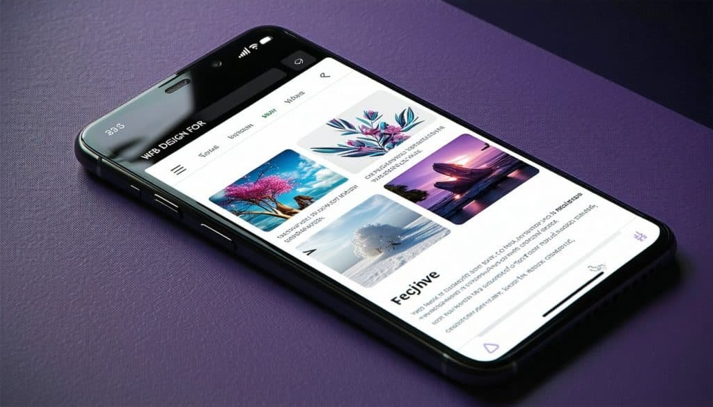
Establishing Mobile-Friendly Content Hierarchy
Content prioritization becomes critical when screen space is limited. Your most important business information must appear prominently without requiring extensive scrolling or navigation. This typically means featuring your primary service, contact information, and main call-to-action above the fold on mobile devices.
Typography considerations take on greater importance in mobile-first design. Text that appears readable on desktop screens often becomes too small or cramped on smartphones. Choose font sizes that remain legible without zooming, typically 16 pixels or larger for body text.
These mobile considerations should align with current web design trends that prioritize mobile user experience over desktop-first approaches.
Mobile Content Essentials
Key mobile design elements: • Font sizes 16px or larger for comfortable reading • Touch-friendly buttons (minimum 44px tap targets) • Concise headlines that work on small screens
• Prominent contact information above the fold • Simplified navigation with clear categories
Calls-to-action require special attention in mobile environments. Concise language works better than lengthy explanations since mobile users typically want quick, clear next steps. Phrases like “Call Now,” “Get Quote,” or “Schedule Service” communicate more effectively than paragraph-long descriptions.
Button sizing affects usability significantly on touchscreens. Ensure adequate spacing around interactive elements so visitors can tap accurately without accidentally triggering adjacent buttons or links.
Simplifying Mobile Navigation Systems
Complex navigation structures that work reasonably well on desktop computers become major obstacles on mobile devices. Smartphone users typically want direct access to key information rather than exploring detailed menu hierarchies.
This simplified approach builds upon proven web design best practices while adapting specifically for mobile constraints.
| Navigation Element | Desktop Approach | Mobile-First Approach |
|---|---|---|
| Menu Items | 7-10 main categories | 3-5 essential categories |
| Contact Info | Header or footer placement | Prominent, always visible |
| Search Function | Optional feature | Critical for content discovery |
| Dropdowns | Multi-level menus acceptable | Single-level preferred |
Limit your primary navigation to essential pages that serve most visitor needs. Core categories like Services, About, and Contact usually provide sufficient organization for most small businesses without overwhelming mobile users with choices.
Strategic placement of critical contact information reduces navigation requirements entirely. Many Cartersville customers prefer calling directly rather than browsing multiple pages, so make phone numbers easily accessible from every page.
Menu labels should use clear, concise language that immediately communicates their purpose. Creative naming that might seem engaging on desktop often confuses mobile users who want straightforward navigation options.
Optimizing Visual Performance for Mobile Networks
Image optimization becomes even more crucial for mobile experiences since many users browse on cellular networks with varying speeds and data limitations. Large, unoptimized images can significantly slow loading times while consuming customer data allowances.
Performance optimization strategies: • Compress images to balance quality and file size • Use modern formats like WebP when platform supports them • Implement lazy loading for images below the fold • Minimize autoplay videos that consume data unexpectedly • Choose hosting with content delivery networks (CDNs)
Compression techniques should balance file size with visual quality to ensure professional appearance without performance penalties. Modern image formats like WebP offer superior compression compared to traditional JPEG files when supported by your website platform.
These performance considerations work hand-in-hand with user experience design principles that prioritize fast, frustration-free browsing experiences.
Video content requires careful consideration in mobile-first designs. Autoplay videos that might enhance desktop experiences often frustrate mobile users by consuming data and battery life unexpectedly. Provide user controls and clear indicators when video content is present.
Real-World Testing and Validation
Desktop simulators and browser developer tools provide useful starting points for mobile testing, but they cannot replicate the complete mobile user experience. Actual device testing reveals issues that simulations miss entirely.
Mobile testing checklist:
- Connection speed testing – Verify performance on 3G and 4G networks
- Cross-browser compatibility – Test on iOS Safari and Android Chrome minimum
- Device orientation – Ensure functionality in both portrait and landscape modes
- Touch interaction – Confirm all buttons and links are easily tappable
- Real user feedback – Gather input from actual customers using mobile devices
Test your site using different connection speeds to understand how it performs on various cellular networks. What loads quickly on high-speed wifi might frustrate customers using slower data connections.
Cross-browser compatibility matters more on mobile devices since users cannot easily switch browsers if they encounter problems. Test your site on both iOS Safari and Android Chrome at minimum to catch rendering inconsistencies.
This testing approach should integrate with your overall SEO optimization strategy since mobile performance significantly impacts search rankings.
Implementation Roadmap for Local Businesses
Begin with an audit of your current mobile experience by using your smartphone to complete typical customer tasks like finding your hours, viewing services, or getting contact information. Note any friction points or confusing elements.
Mobile optimization phases:
Phase 1: Foundation (Week 1-2)
- Audit current mobile experience and identify major issues
- Optimize critical pages for mobile viewing and interaction
- Ensure contact information is easily accessible
Phase 2: Performance (Week 3-4)
- Compress and optimize all images for faster loading
- Implement mobile-friendly navigation structure
- Test loading speeds on various connection types
Phase 3: Refinement (Week 5-6)
- Gather user feedback on mobile experience
- Fine-tune button sizes and touch interactions
- Monitor analytics for mobile user behavior patterns
Prioritize improvements that directly impact customer conversion rather than attempting comprehensive redesigns immediately. Often, adjusting button sizes, simplifying navigation, or improving loading speeds produces measurable results quickly.
Consider the specific needs of Cartersville customers who might be researching your business while driving through town or comparing local service providers during busy schedules. Your mobile experience should accommodate these real-world usage scenarios.
Mobile-first design principles should integrate seamlessly with your branding and visual design strategy to ensure consistent experiences across all devices and touchpoints.
The goal is creating mobile experiences that serve your business objectives while respecting the constraints and opportunities that smartphones present to local customers.
Ready to optimize your website for mobile users? Contact our mobile design experts to discuss how mobile-first design can help your Cartersville business reach more customers and improve conversion rates.
This article is part of our comprehensive web design series for Cartersville area businesses. Explore our complete collection of marketing resources or discover more about our mobile-first approach to effective business websites.